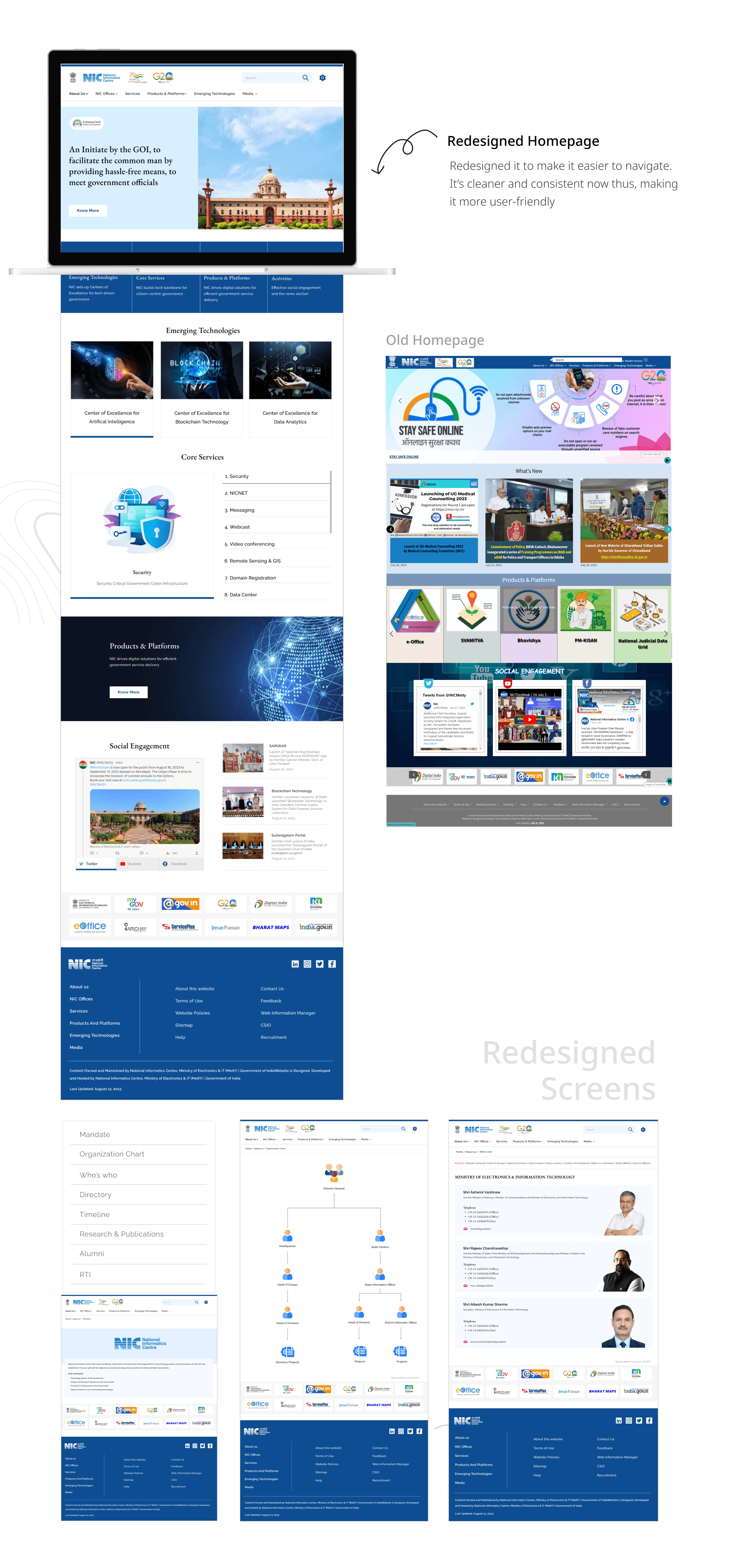
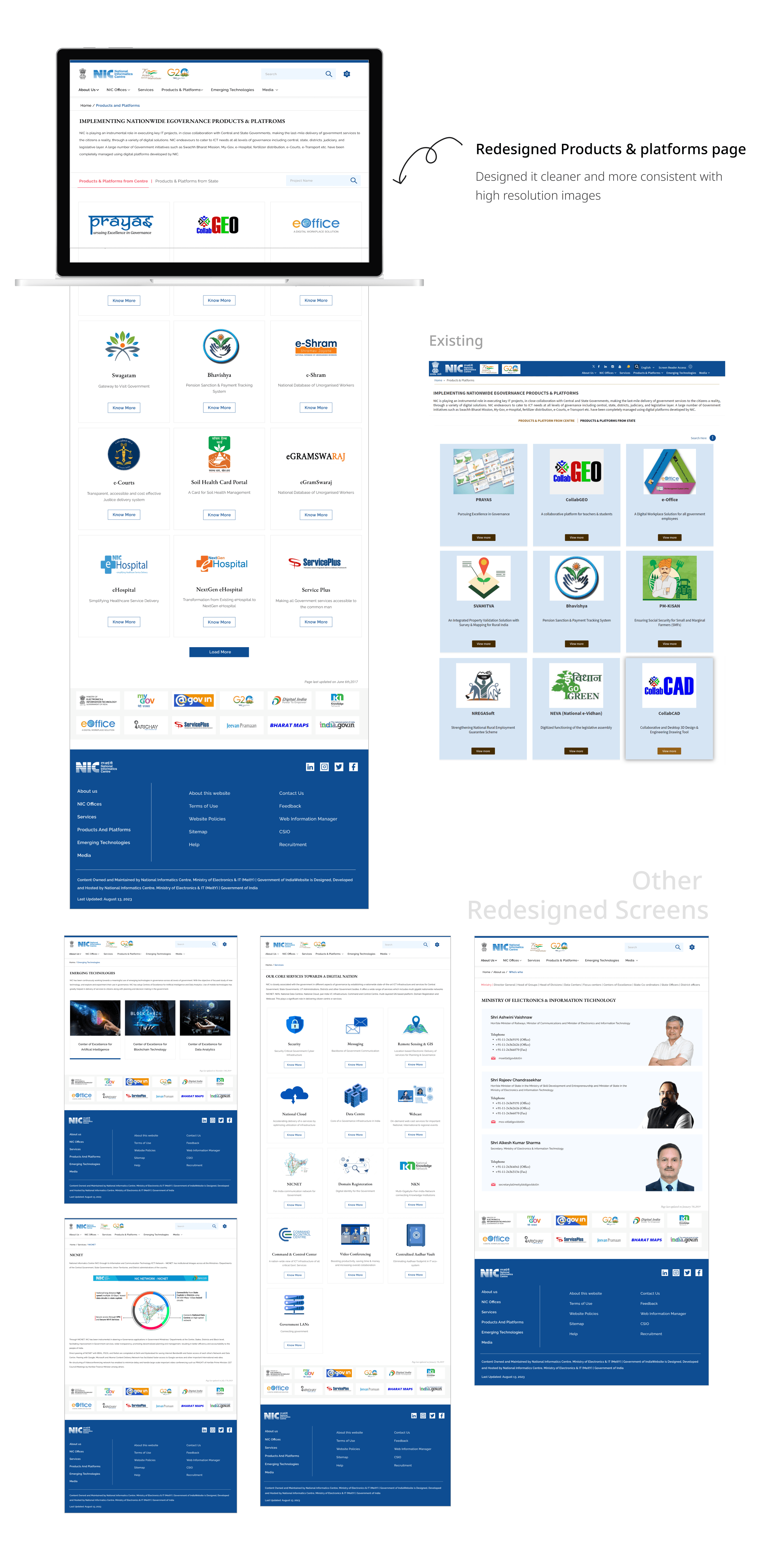
Redesign project: NIC Website
Elevating the user experience of existing National Informatics website by enhancing its usability, visual appeal, and functionality.
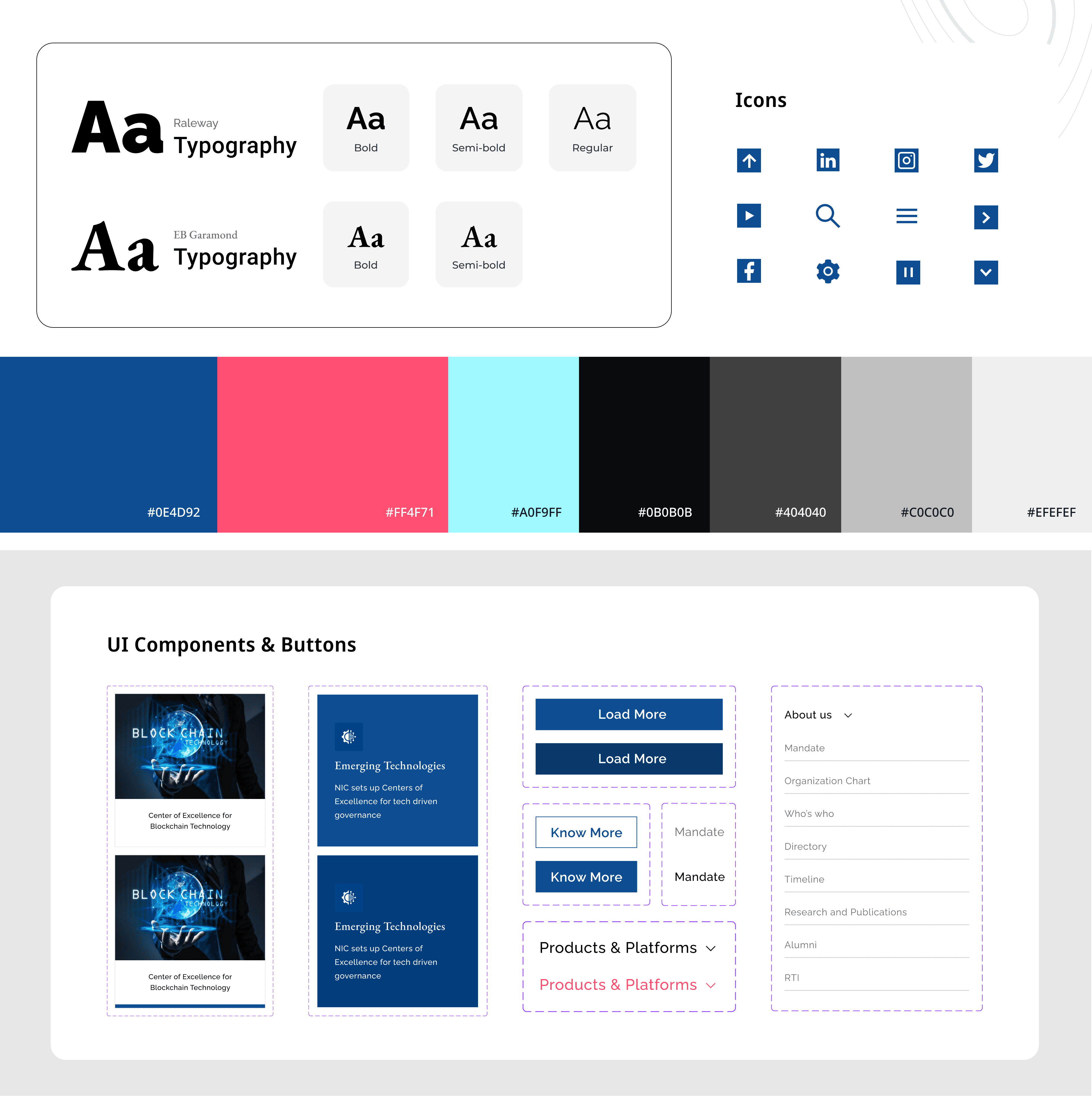
Stage 5. UI Style Guide
I created a UI style guide to keep my designs consistent and professional. This guide includes rules for colors, fonts, buttons, and other elements, ensuring everything looks cohesive and matches the overall design vision across all projects.
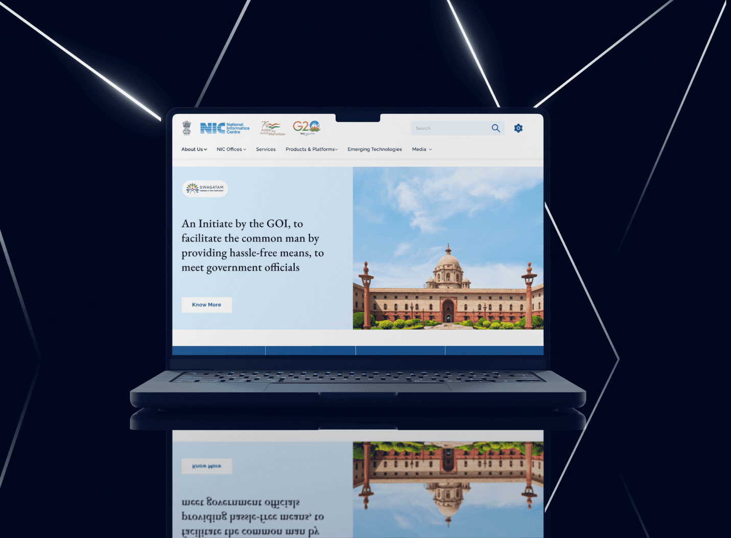
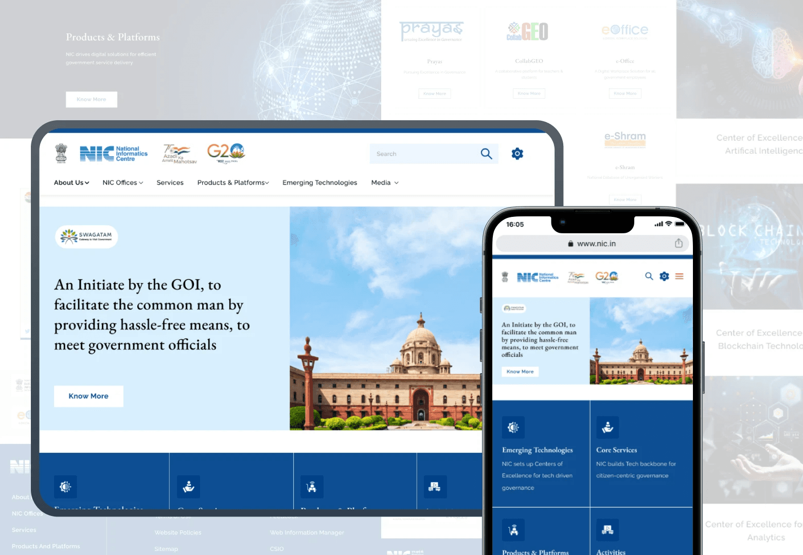
Stage 6. User Interface Design
I focused on creating user interfaces that are both visually appealing and easy to use. This involves designing elements like buttons, menus, and icons to enhance the overall user experience. My goal is to make interactions smooth and enjoyable, keeping the design consistent and aligned with the overall brand.
Other projects

This UX/UI design case study creates a digital platform to enhance art therapy for therapists and clients. It prioritizes user-centered design, delivering an intuitive interface for emotional expression, collaboration, and engagement in virtual sessions.
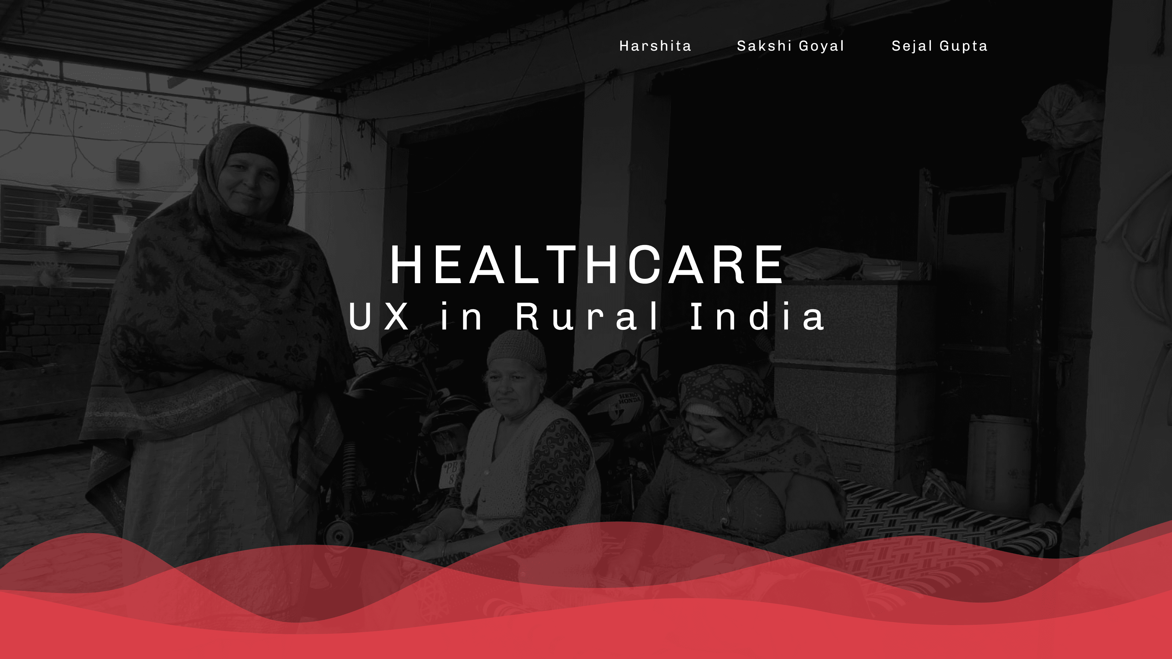
This UX project tackles menstrual health challenges in rural Punjab with empathetic, locally-tailored designs. Our goal is to enhance well-being, foster open menstruation discussions, and celebrate menstrual health in these communities.
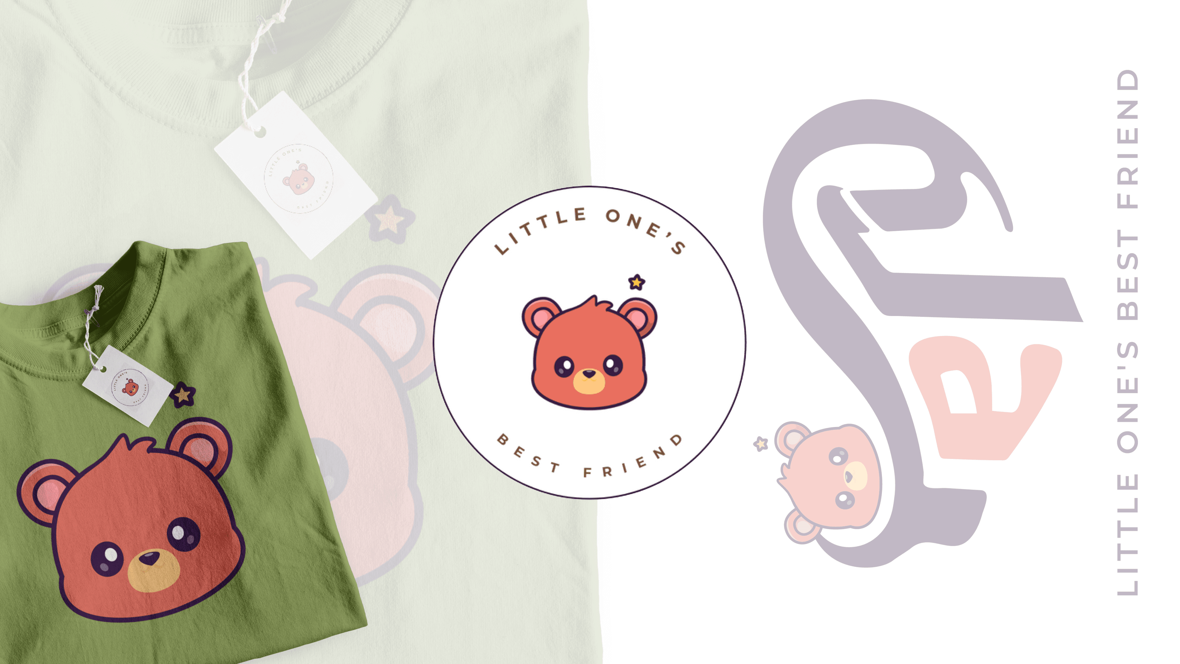
Creating a vibrant and playful brand identity for Tery, a brand that offers soft & affordable essentials designed to delight both babies & parents.